http://www.brazilianartists.net/home/flags/
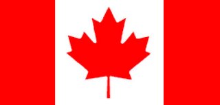
Originally posted by Anthony, I thought it was really thought-provoking, and very original. I don't get impressed by art or politics too often, but this, at the intersection of both, really caught my attention. Well, I didn't see the flag of my country there, so I took the original concept and applied it. It only took me a few minutes to figure out the surface area colours by percentage, since I found a grid-lined version of our official map. Interestingly, the National Flag of Canada is about two-thirds red, and without the leaf, it would be exactly half red. (What, did you think I was American?)
Here's my flag. After doing my research, I realised It's really hard to come up with statistics that are real that fit the proportions of a flag and that are relevant to a country's political landscape, so I have to give the original artist a lot of respect.

Red: Aboriginal population under the age of 25.
White: Aboriginal population not under the age of 25.
Here are a couple of other stats of note I uncovered:
- Red: General population not under age of 25.
White: General population under the age of 25 - Red: Educational workers that are female.
White: Educational workers that are male - Red: Forest fires (land burned) due to human activites.
White: Forest fires (land burned) not due to human activity.
I'd be interested to hear any feedback or other stats.
Daniel
3 comments:
Nice stats, it is hard isn't it? (That's why I didn't try.)
I think the general stats one is "better" than the aboriginal population stats one... except when taken together that is. Think about it: you pay for your parents' social security. With the general population aging and reaching retirement and noone to replace them, we've got a crisis on our hands... And they are talking about LIMITING immigration?
Daniel, just read about the the downsising GM is planning on doing. Will you be affected by any of this!?
Cheers
P
Post a Comment