http://www.brazilianartists.net/home/flags/
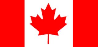
Originally posted by Anthony, I thought it was really thought-provoking, and very original. I don't get impressed by art or politics too often, but this, at the intersection of both, really caught my attention. Well, I didn't see the flag of my country there, so I took the original concept and applied it. It only took me a few minutes to figure out the surface area colours by percentage, since I found a grid-lined version of our official map. Interestingly, the National Flag of Canada is about two-thirds red, and without the leaf, it would be exactly half red. (What, did you think I was American?)
Here's my flag. After doing my research, I realised It's really hard to come up with statistics that are real that fit the proportions of a flag and that are relevant to a country's political landscape, so I have to give the original artist a lot of respect.

Red: Aboriginal population under the age of 25.
White: Aboriginal population not under the age of 25.
Here are a couple of other stats of note I uncovered:
- Red: General population not under age of 25.
White: General population under the age of 25 - Red: Educational workers that are female.
White: Educational workers that are male - Red: Forest fires (land burned) due to human activites.
White: Forest fires (land burned) not due to human activity.
I'd be interested to hear any feedback or other stats.
Daniel

